


Where All the Money's Going
It's Pretty Much Where You'd Think, But More So

I’m old enough to remember when Republicans talked, for decades, about how Democrats and their reckless social spending were responsible for most of the national debt. It was a favorite talking point of Reagan’s. Most of the Republicans who followed him leaned into his message. The first person to really challenge that narrative was Democratic Senator Daniel Patrick Moynihan, of New York, who organized a study to track revenues and expenditures by state, in 1977. But it wasn’t until sometime in the 2000s when the realities of who was paying taxes and who was spending them started to be discussed widely. Every so often I come back to it, to see what the current research is saying. It’s usually pretty interesting.
Recently I got onto The Rockefeller Institute’s Balance of Payments Portal, which provides some cool info-graphics and some data about which states are spending, which are paying, and how much. And, again — interesting. In 2022, eleven states paid more in federal taxes than they got back. Ten of those states went for Vice President Harris in the 2024 election. Which is already a pretty telling factoid. Of the 31 states that went for Trump in 2024, all of them except Utah are spending against the national debt. Of the 19 states that went for Harris, more than half are contributing more to the U.S. budget than they get back. The ten Democratic states (and Utah) that got less back than they put in were shorted $179 billion in 2022 (Utah’s contribution there was $709 million, in case you were wondering). The states that exceeded their contributions took in a total of $1.08 trillion more than they paid.
But I started to wonder what else those numbers might mean. Unfortunately, the RI site doesn’t provide a lot of tools for messing with the data. So I opened a spreadsheet and took a whack at it and the answers I got back are kind of a trip. Skip to the bottom if you just want the punch line, but I want to show how I got there so I’m going to walk through it here. First, the balance of payments in 2022 (numbers are in millions):

That’s basically just the numbers from the RI website, distributed by which states went for which candidate in 2024. All the Democratic states together netted $92.7 billion more than they contributed to the federal budget in 2022. The Republican states netted $806.9 billion. So that’s fairly striking. But there’s room for ambiguity, because we’re talking about states. If the Democratic states had tiny populations, the difference might not be as big as it looks in raw numbers. So I put together the same chart, showing the RI’s numbers for total federal tax payments, by state (amounts still in millions):

So, almost tied, in terms of pure dollar value of taxes paid into the budget. But, you know, those numbers still don’t really jump out. So I charted the per capita revenues listed on the RI site, then worked backward against the total federal tax revenues to extrapolate the population figures the RI researchers used for each state. Then I separated them by 2024 vote, and added them up. Dems had 138,672,496. States that went for Trump in 2024 had a total population of 193,927,966. Which meant that I now had the base numbers I needed to calculate national per capita revenues, by 2024 voting patterns (actual number of dollars per person, not in millions):
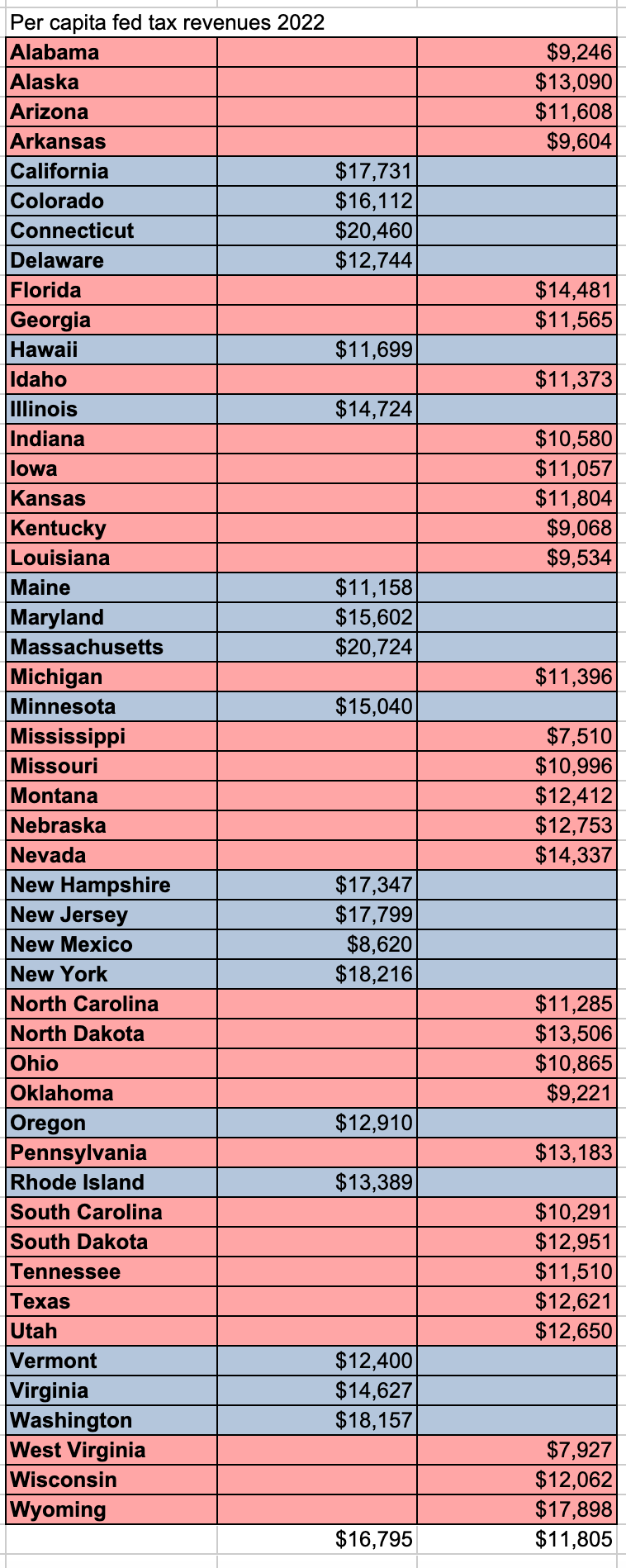
To be clear, the numbers in white at the bottom of that chart aren’t sums or averages of the state numbers above. They’re the total from the bottom of “Fed tax revenue 2022, by 2024 vote,” multiplied by 1,000,000 (because the dollar amounts were in millions) and divided by the population numbers I just mentioned. So, on average, states that went for Harris paid about $5,000 more in taxes, per person — roughly 30% more — than states that went for Trump.
Which naturally leads us to the question of how much the federal government spends in each of those states, in whole dollars, and then per capita. Both numbers are on the RI website, so I just charted them. The total dollars spent (amounts in millions):

And the per capita amounts spent (numbers reflect actual dollars per person, not millions):
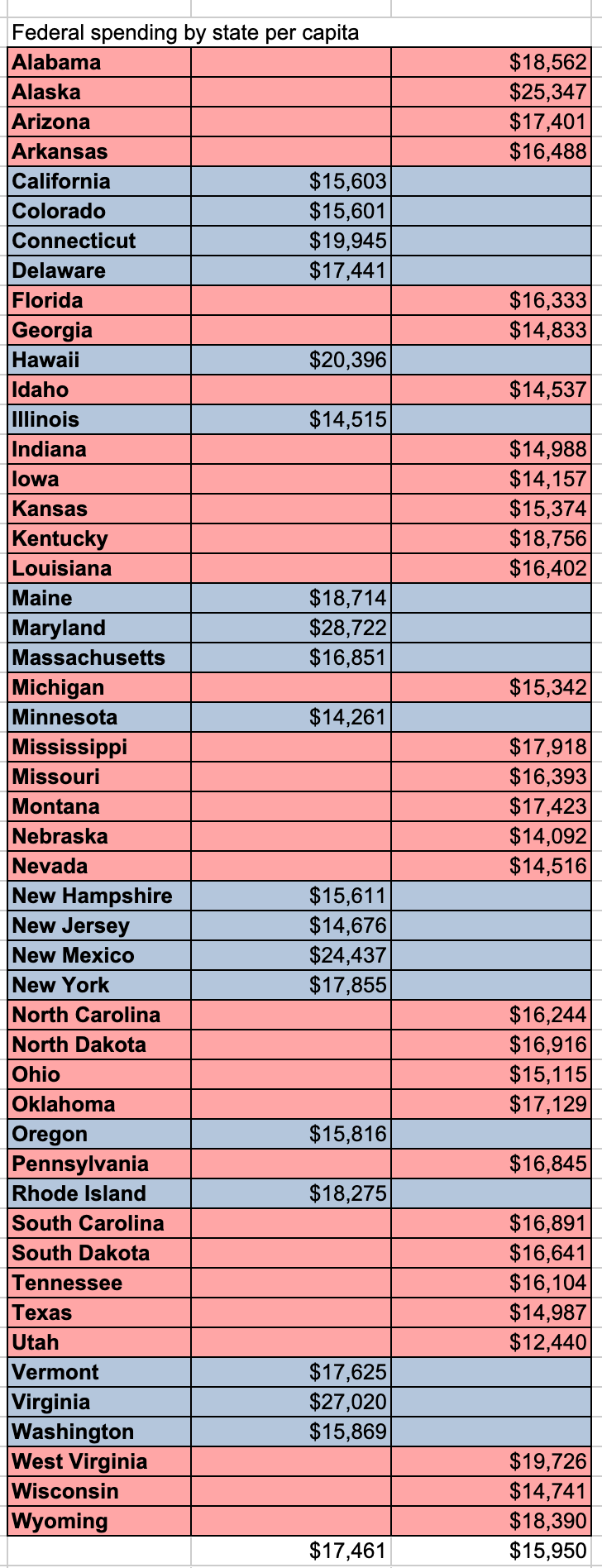
And again, that number in white isn’t a sum of the stuff above it. It’s the total of national spending, by party, divided by the total of the national population, by party. But the gap between the numbers still doesn’t seem very big. Like, it’s big. But it’s not huge. Except for the first few charts, the difference between the benefit Republicans get from the federal government, compared to what Democrats get, looks like a bunch of relatively small breaks. Dems pay about 30% more taxes per person. They pay about 25% more in total receipts. They have about 30% fewer people. They actually get about 10% more in gross per capita spending, but that makes a certain amount of sense, because they’re paying so much more. So what’s it add up to, nationally? We know Democratic states and Republican states both get back more than they pay out, because the federal government operates at a significant loss every year. But who’s getting most of that money? It’s the Republicans, certainly. But is it a lot? Does it matter?
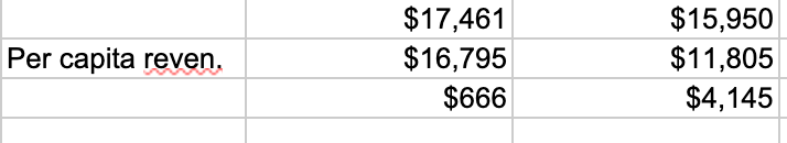
This is a place where we can just subtract those numbers in white. The national per capita spending minus national per capita revenues gives us national per capita deficit spending. Nationally, people in the states that went for Harris in 2024 get $666 more back, per person, than they contribute to the federal budget. Republicans get $4,145 more, per person.
More than six times as much.
I’ll refer back to this later.